
.png)
University Replaces Signs: Reasons and Reactions Behind UO’s New Signs
- Jack Webb
- Oct 13, 2024
- 3 min read

A picture of one of the new signs, taken just outside of the Upton Conservatory of Music. Photo taken by Jack Webb.
On Aug. 19, the 2024-2025 school year kicked off, but it wasn’t without some changes around campus. That’s because, during the summer, The University of Olivet put up new signs, which will replace the ones that have been up for over a decade. However, just as there are reasons behind this change, there are also mixed reactions, as well.
Ryan Shockey, the vice president and chief of staff for The University of Olivet, said, “Increasing the effectiveness of our on-campus signage and brand awareness started with our name change in the Fall of 2023. The new signs installed this summer are the first phase of this project to identify our academic and public buildings more clearly.”
Shockey also noted that the process of putting the signs up has not been completed yet, and that “over the next year,” the university hopes to roll out more of the new signs to put in front of the rest of the buildings on campus.

A picture of one of the old signs, taken just outside of the Upton Conservatory of Music. Photo taken by Jack Webb
Additionally, Shockey expanded on the differences between the two signs. He said, “You may have noticed that the old signs are smaller and quite difficult to read. Many of the old signs simply were not visible from the road to traffic on campus, making it difficult for people to identify them easily. Another need for the new signs was for the university to clearly mark the building addresses for emergency response personnel if they are called to respond to an on- campus emergency...”
Shockey continued to say, “Our intention will be to continue this project over the next year or so to aid in navigating campus and make it easier for emergency response units to identify the correct buildings as they respond to campus needs.”
Lisa Collins, graphic designer and brand manager for The University of Olivet, said, “The newer signs are bigger, easier to read with the address number more prominent.”
The new aluminum signs, which Collins said were made by Comstock Park’s Valley City Signs, are a departure from the previous designs.
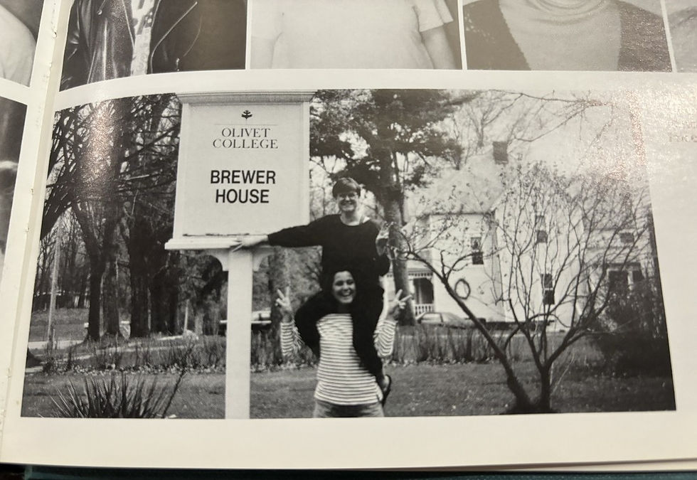
The sign in front of the old Brewer House, included in the 1992 yearbook.
From the mid-1970s to the early 2000s, Olivet College had signs that were just as tall as the ones being replaced, but they also had a much bigger font that made the name of the building they were in front of more recognizable.
It was only within the past decade or so that the signs with small fonts were being used. However, Olivet didn’t always have these building markers.
Mike Fales, a professor at The University of Olivet who graduated from the institution in 1975, gave an explanation of the history of these signs, as well as what it was like for him as a student.
“When I first got here, there weren’t many signs other than the two that are on main street. There were signs, and until they made a change a few years ago, they were the same signs that were here when I was here as a student fifty years ago,” Fales said.
Fales also gave a description of what these older signs looked like. He said, “The signs that were initially put up on campus were pretty similar to the ones that these (the new signs) replaced, it was a pole with a rectangular box on top of them.”
Fales said that the signs that he saw as a student were designed by someone who came from Albion College, and this designer took inspiration from Albion’s design. However, it came with a catch. There were some students at the time saying that the new signs were “copied” from Albion.
Although there isn’t any talk of these new signs being a rip-off of another institution’s signs, the reactions to these signs are still mixed.
Fales said, “They are obviously contemporary, but they’re much more substantial than the old signs were. So, to me, they convey a sense that Olivet is here to stay.”
He went on to add that he could tell that the designers put a lot of thought into them, and that the new signs “convey university instead of small college”.
Luke Stoneman, a senior at The University of Olivet, said that he also liked the signs, “I think the new signs, in and of themselves, completely removing anything else that needs done on campus, look good. They look like good signs, they look like good effort was put into them...I don’t really see why people are super upset about it,” he said.
Dade Allen, a sophomore, was critical, “I don’t really care for them. I get that they are trying to get rid of the ‘Olivet College’ stuff, but I feel like it was a waste of money and a waste of time,” he said.
John Barry, a senior, called them “tacky”, and said that, “at least the old ones looked like they were a part of the college, they looked aged, they looked old, they looked like they had history. These ones are too bold, there was no need for them,” he said
Another senior, Taylor Darhower, didn’t mind the signs, but also said that “they are not Olivet”. Melissa Patton, a recent graduate of the institution, made her feelings known, as well, “I don’t know who they think they are. We are not that.”
A feature of the sign in front of Dole Hall, said Shockey, “provides a campus map on the back side, allowing visitors to navigate campus more easily during their visits.” Students like
Stoneman also admire the Dole sign and he pointed out that it would be “beneficial” if more signs had campus maps on them.
Written by Jack Webb
Comments